I have made the case that there is no recovery, only number jiggering and artificial good times via stimulus, and once that wears off, we're heading back into the dumps. But, understandably, some might be tempted to go back over to the dark side, where Keynesianism does what it is supposed to do and optimism has no bounds. After all, it's been two whole years. If things were really going to go bad, wouldn't it have happened already?
Luckily, I have just the thing to cure those doubters who are starting to feel their spirits lifted by the infectious optimism that is spreading through the markets these days. I have compiled a series of Graphs of Doom that should put you more in the spirit.
Monetary & Banking Graphs
This is one of my favorites, the adjusted monetary base:

Note the skyrocketing supply of high-powered money of 2008-2010. Scary. This money was used to buy off bad assets from the banking system, but now the FED has the problem of getting it back out of the banking system without throwing the economy back into tailspin, or leaving it in there without causing mass inflation. This is, of course, an impossible conundrum.
This threat to mankind now constitutes the bulk of the reserves of the banking system:

The reason it hasn't caused mass inflation yet is because it is all sitting idle as excess reserves:

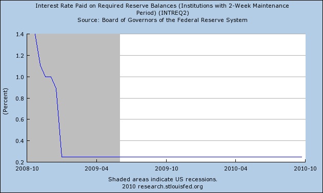
To keep the banking system from lending out this money and immediately destroying the US economy as we know it, the FED sought the power to pay interest on these reserves, incentivising the banks not to lend:
Borrowings from the FED in the Financial Crisis of 2008 also added to all those reserves:

Government at Work
The massive stimulus plan also manages to show its ugly head as Treasury deposits held with the FED:

Here's a really scary one -- the deficit/surplus, and its relative, net savings (if any) of the Federal Government:


Gross Federal Debt:

Current account balance (e.g. 'the trade deficit'):


The Economy
The housing market isn't recovering any time soon, if residential fixed investment has anything to say about it:

Here's an interesting one --gross private domestic investment:

Gerard Jackson had something very interesting to say about this particular statistic:
I believe this process [distortion of the production structure by government overspending 'crowding out' the private sector] is already underway. Since the Democrats took control of congress in 2007 federal spending has leapt by 25 per cent. (The atmosphere of uncertainty created by the Democrats' approach to regulations and taxes was bound also to aggravate an already severe economic environment.) While mainstream economists tend to focus on net investment it is gross investment (gross savings) that maintains the capital structure and hence the standard of living. Right now the situation is not looking very healthy.
Figures from the Bureau of Economic Analysis show that for 2009 gross private domestic investment was $1,515.7 billion compared with $1,957.3 billion in 2008 (2005 dollars) while the respective figures for net investment were $517 billion and $54.4 billion. (The gross investment figures reveal just how much it takes to maintain America's capital structure.) For net fixed investment the respective amounts were $556.7 billion and $169.3 billion. This is a huge drop. Moreover, while it is true that gross private domestic investment for the second quarter of 2010 reached $1,838.7 billion this should be compared with the peak figure of but $2,230 billion for 2006, a difference of 21 per cent. (The net investment figures have yet to be released.)
The evidence -- supported by sound economic theory -- strongly suggests that unless the Democrats' anti-growth policy of draining more and more resources from the private sector is reversed it will eventually have a severe detrimental effect on the American standard of living.
(emphasis added)
It is saving and investment that will repair the damage of the previous boom. This particular graph goes to the very heart of the issue of 'recovery,' so even though it might not look as disturbing as the others, it is important and doesn't look very good.
That about wraps it up for today.
Conclusion
Don't let appearances fool you. We're not out of the woods yet. Some say we're in the eye of the hurricane. Some think worse.
Count me in the worse camp. Default is coming.
No comments:
Post a Comment